Brand Identity
Betuwe Logo
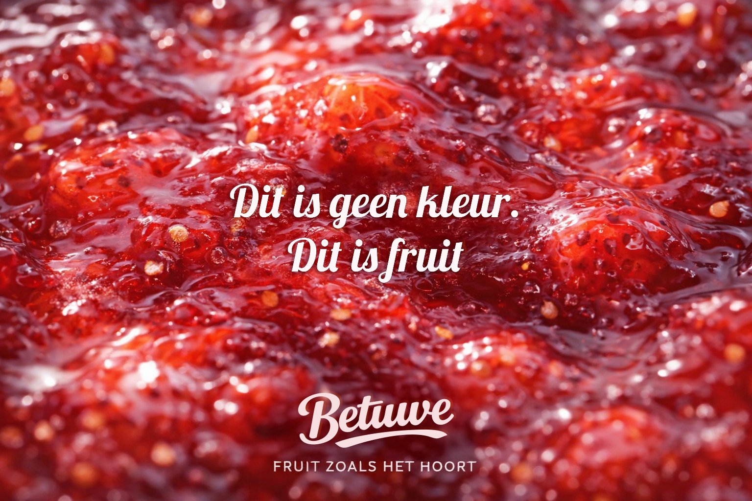
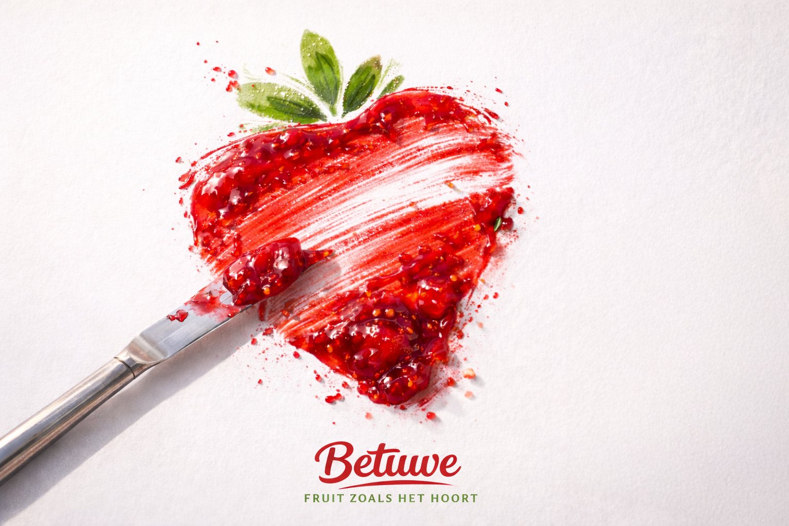
A full brand campaign for Betuwe — "Fruit zoals het hoort." Art direction, campaign visuals, and motion content celebrating authentic Dutch fruit products.
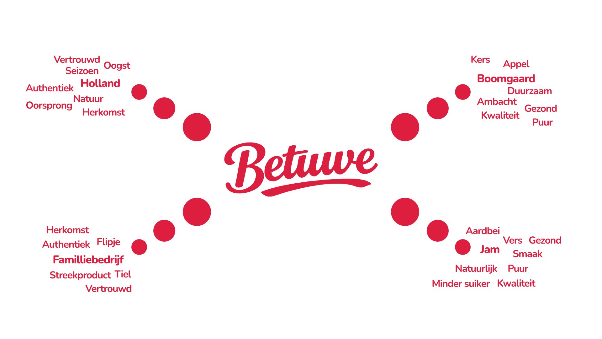
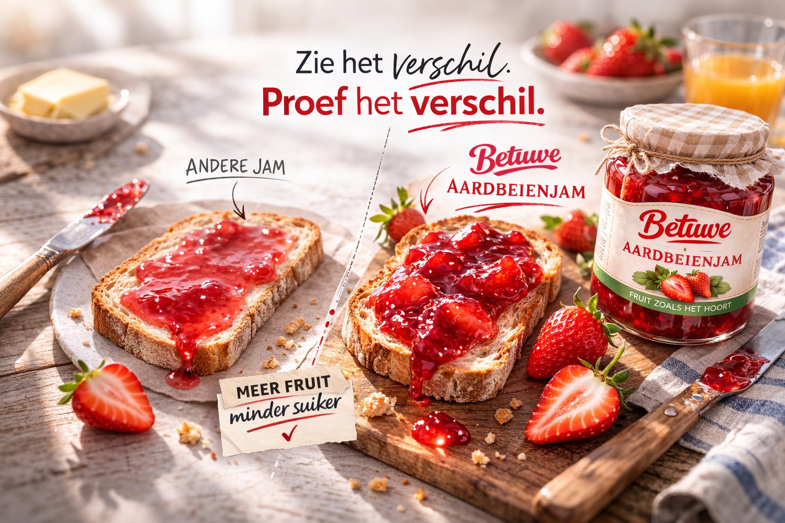
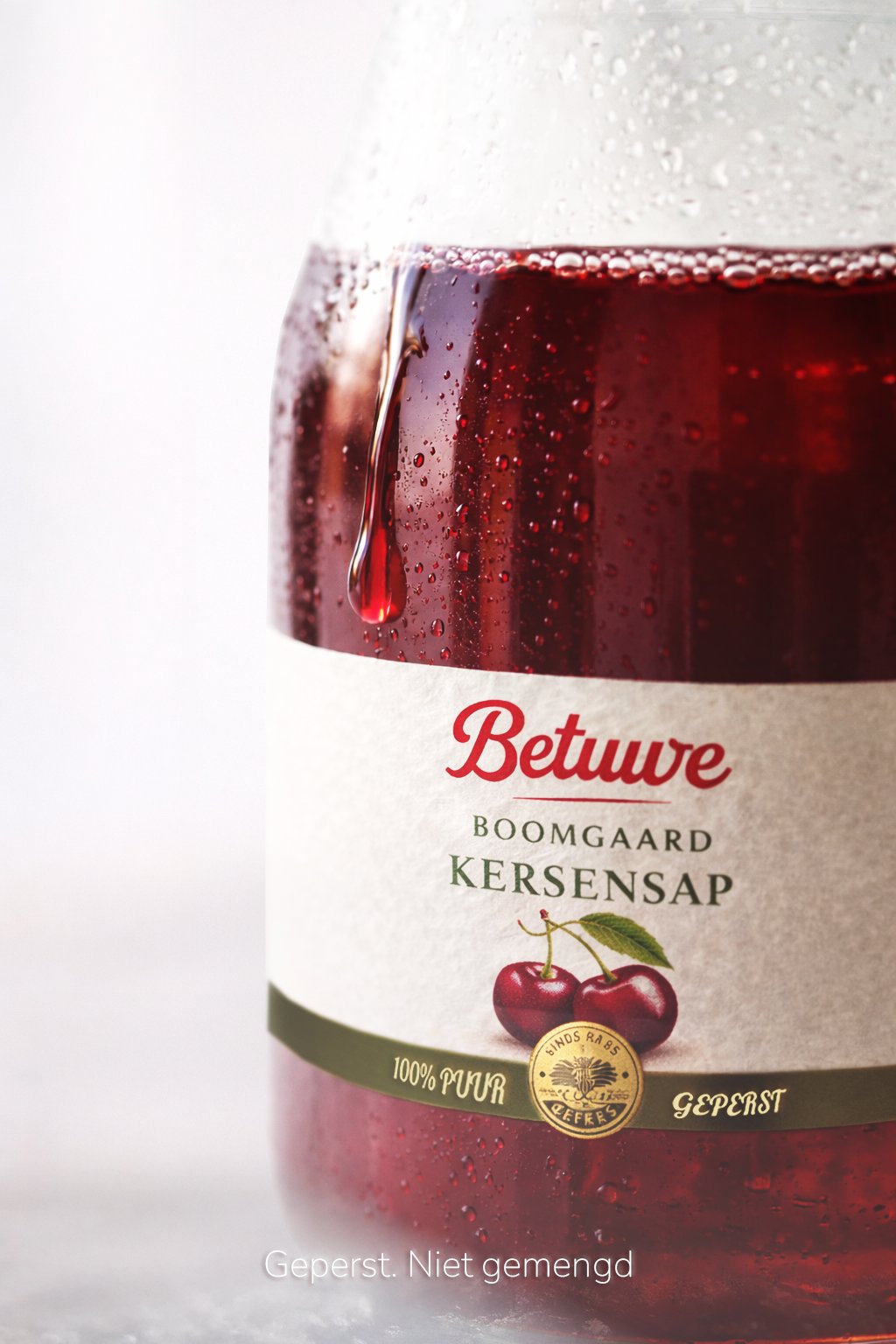
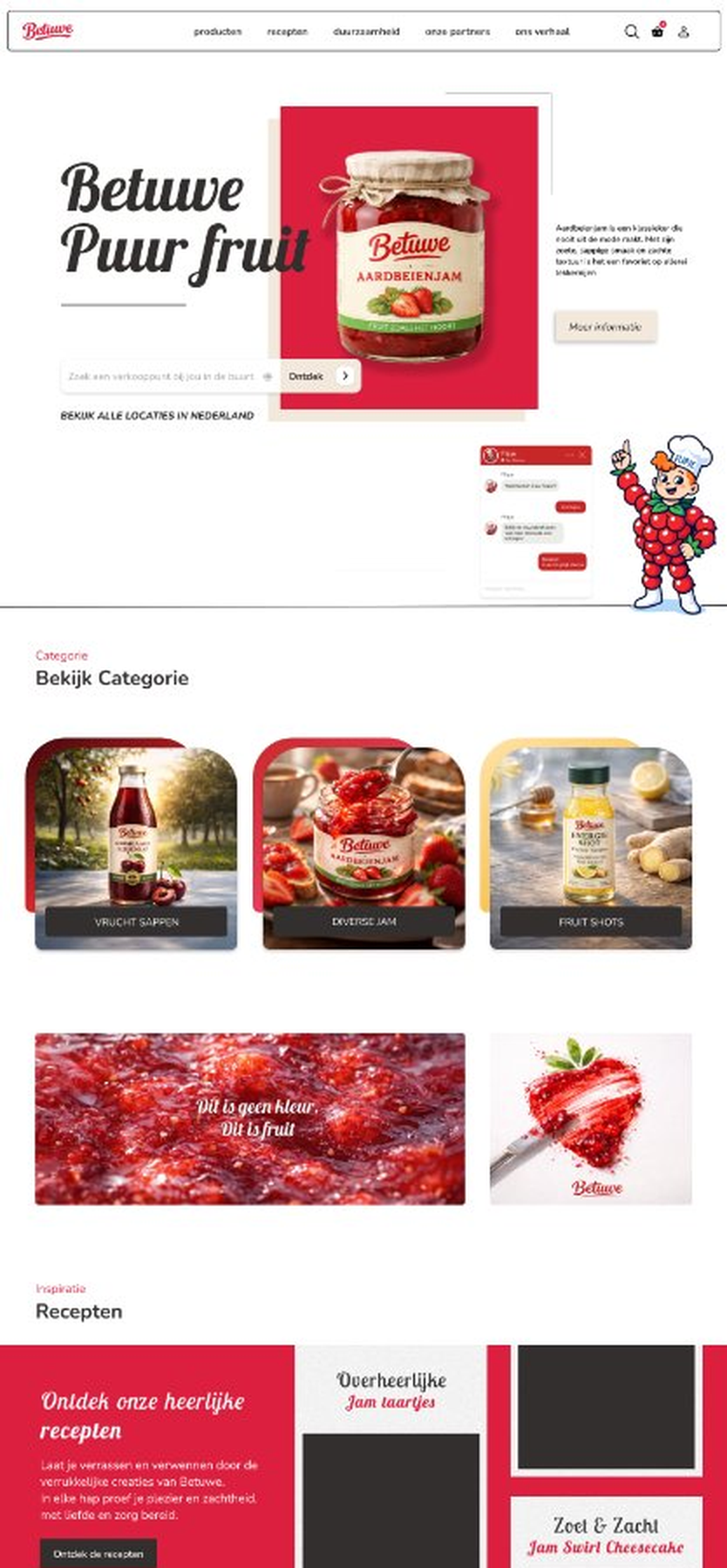
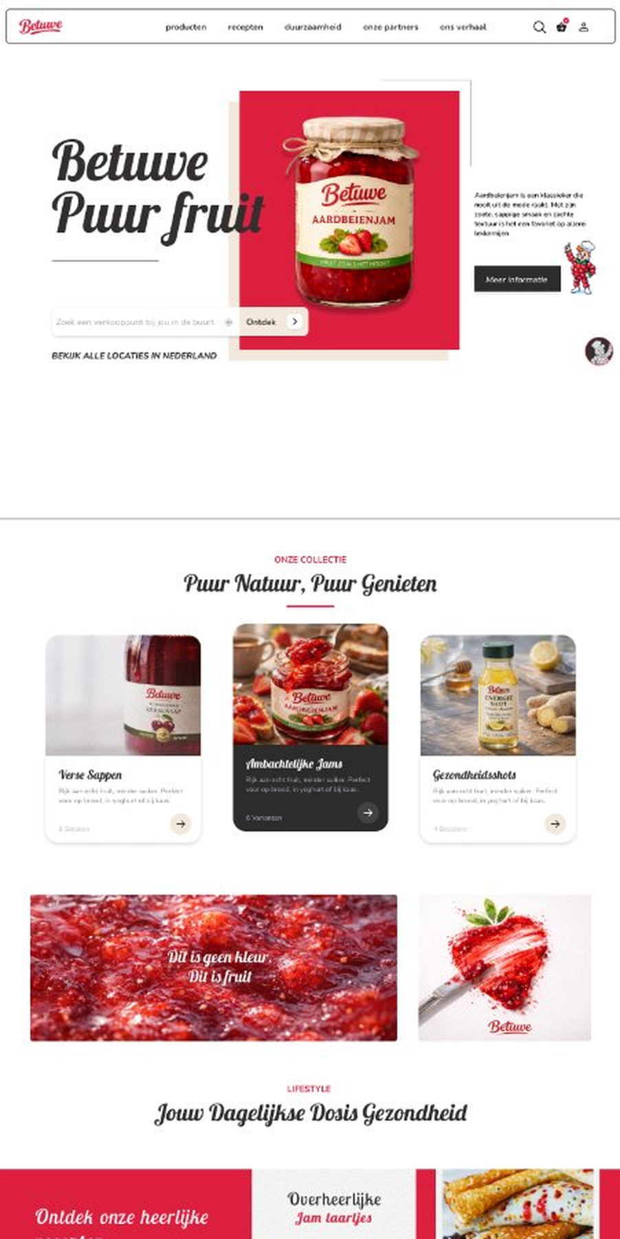
Betuwe is one of the Netherlands' most iconic fruit brands — known for their jams, juices, and spreads made from real, pure fruit. The brief was to create a campaign that cuts through supermarket noise and repositions Betuwe as the authentic choice in a market full of artificial alternatives.
The campaign "Fruit zoals het hoort" (Fruit as it should be) centered on raw, sensory visuals — real fruit in motion, product shots with confidence, and a direct tone that speaks to quality without pretension.
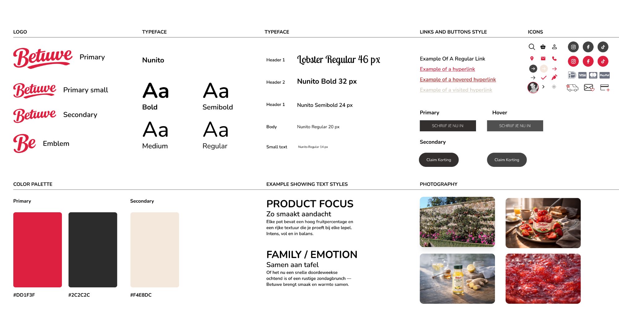
The style tile defined the visual language for the Betuwe redesign — typography, colour palette, button states, and iconography all documented before a single screen was built.
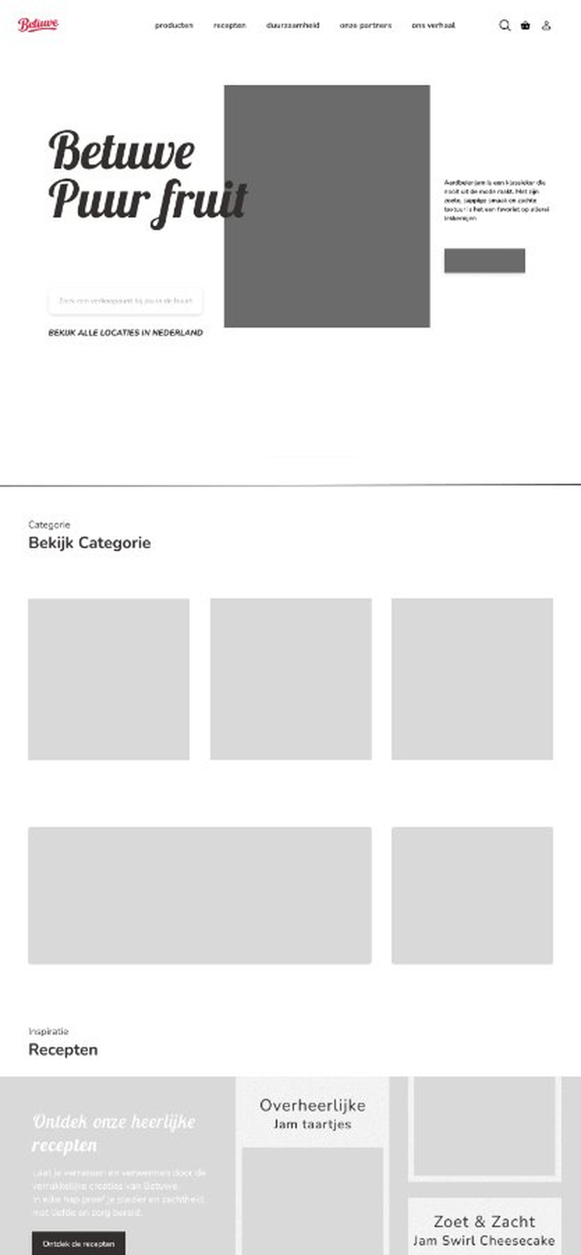
Three stages of the wireframe process — starting from a bare low-fidelity skeleton, building towards a fully structured layout ready for visual design.
Campaign motion content produced for social and digital channels. Click play — press the ⛶ icon for fullscreen.